6.9 GLMakie.jl
CairoMakie.jl fulfills all our needs for static 2D images. But sometimes we want interactivity, especially when we are dealing with 3D images. Visualizing data in 3D is also a common practice to gain insight from your data. This is where GLMakie.jl comes into play, since it uses OpenGL as a backend that adds interactivity and responsiveness to plots. Like before, a simple plot includes, of course, lines and points. So, we will start with those and since we already know how layouts work, we will put that into practice.
6.9.1 Scatters and Lines
For scatter plots we have two options, the first one is scatter(x, y, z) and the second one is meshscatter(x, y, z). In the former, markers don’t scale in the axis directions and in the latter they do because they are actual geometries in 3D space. See the next example:
using GLMakie
GLMakie.activate!()
function scatters_in_3D()
seed!(123)
n = 10
x, y, z = randn(n), randn(n), randn(n)
aspect=(1, 1, 1)
perspectiveness=0.5
# the figure
fig = Figure(; size=(1200, 400))
ax1 = Axis3(fig[1, 1]; aspect, perspectiveness)
ax2 = Axis3(fig[1, 2]; aspect, perspectiveness)
ax3 = Axis3(fig[1, 3]; aspect=:data, perspectiveness)
scatter!(ax1, x, y, z; markersize=15)
meshscatter!(ax2, x, y, z; markersize=0.25)
hm = meshscatter!(ax3, x, y, z; markersize=0.25,
marker=Rect3f(Vec3f(0), Vec3f(1)), color=1:n,
colormap=:plasma, transparency=false)
Colorbar(fig[1, 4], hm, label="values", height=Relative(0.5))
colgap!(fig.layout, 5)
fig
end
JDS.scatters_in_3D()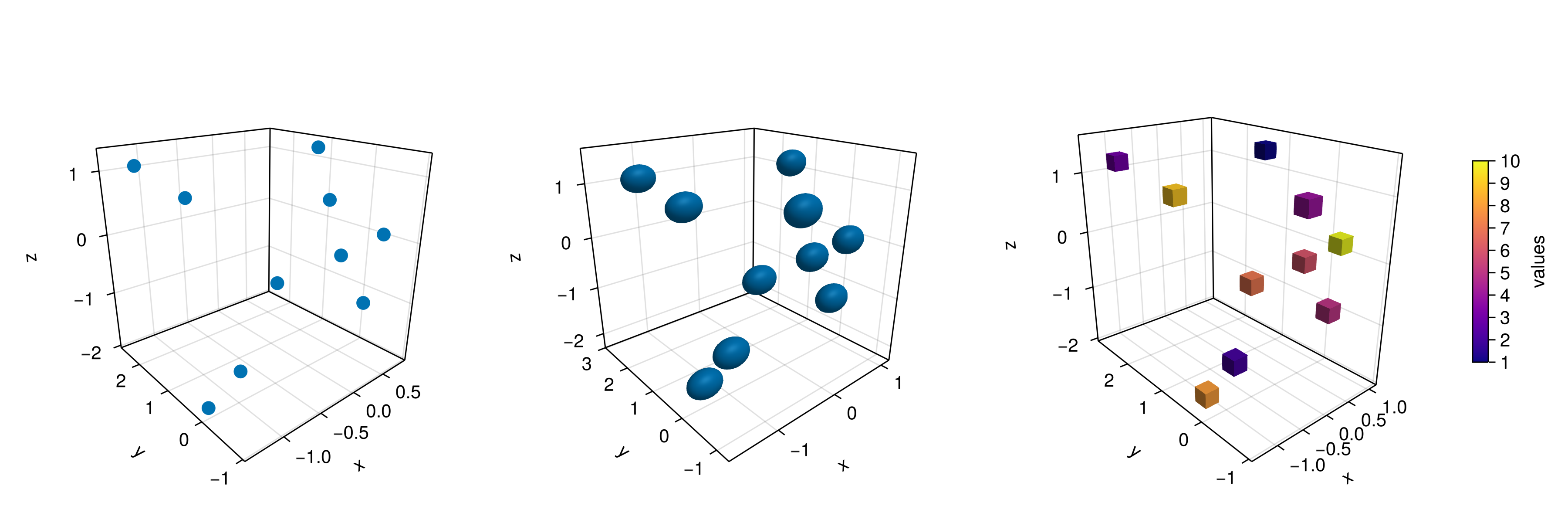
Note also, that a different geometry can be passed as markers, i.e., a square/rectangle, and we can assign a colormap for them as well. In the middle panel one could get perfect spheres by doing aspect = :data as in the right panel.
And doing lines or scatterlines is also straightforward:
function lines_in_3D()
    seed!(123)
    n = 10
    x, y, z = randn(n), randn(n), randn(n)
    aspect=(1, 1, 1)
    perspectiveness=0.5
    # the figure
    fig = Figure(; size=(1200, 500))
    ax1 = Axis3(fig[1, 1]; aspect, perspectiveness)
    ax2 = Axis3(fig[1, 2]; aspect, perspectiveness)
    ax3 = Axis3(fig[1, 3]; aspect=:data, perspectiveness)
    lines!(ax1, x, y, z; color=1:n, linewidth=3)
    scatterlines!(ax2, x, y, z; markersize=15)
    hm = meshscatter!(ax3, x, y, z; markersize=0.2, color=1:n)
    lines!(ax3, x, y, z; color=1:n)
    Colorbar(fig[2, 1], hm; label="values", height=15, vertical=false,
        flipaxis=false, ticksize=15, tickalign=1, width=Relative(3.55/4))
    fig
end

# written by Josef Heinen from GR.jl
JDS.lines_in_3D()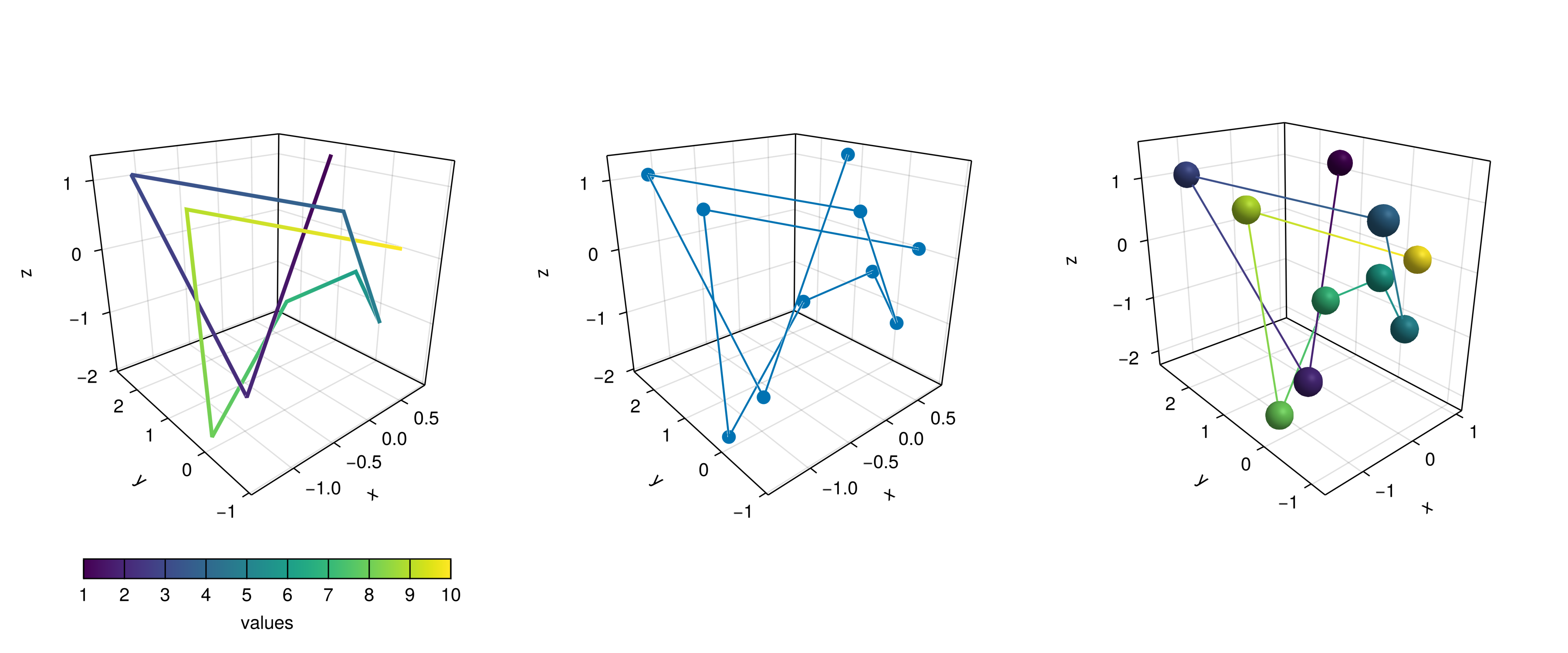
Plotting a surface is also easy to do as well as a wireframe and contour lines in 3D.
6.9.2 Surfaces, wireframe, contour, contourf and contour3d
To show these cases we’ll use the following peaks function:
function peaks(; n=49)
    x = range(-3, 3, n)
    y = range(-3, 3, n)
    a = 3 * (1 .- x') .^ 2 .* exp.(-(x' .^ 2) .- (y .+ 1) .^ 2)
    b = 10 * (x' / 5 .- x' .^ 3 .- y .^ 5) .* exp.(-x' .^ 2 .- y .^ 2)
    c = 1 / 3 * exp.(-(x' .+ 1) .^ 2 .- y .^ 2)
    return (x, y, a .- b .- c)
end
The output for the different plotting functions is
function plot_peaks_function()
    x, y, z = peaks()
    x2, y2, z2 = peaks(; n=15)
    fig = Figure(size=(1200, 400))
    axs = [Axis3(fig[1, i]; aspect=(1, 1, 1)) for i = 1:3]
    hm = surface!(axs[1], x, y, z)
    wireframe!(axs[2], x2, y2, z2)
    contour3d!(axs[3], x, y, z; levels=20)
    Colorbar(fig[1, 4], hm, height=Relative(0.5))
    fig
end
JDS.plot_peaks_function()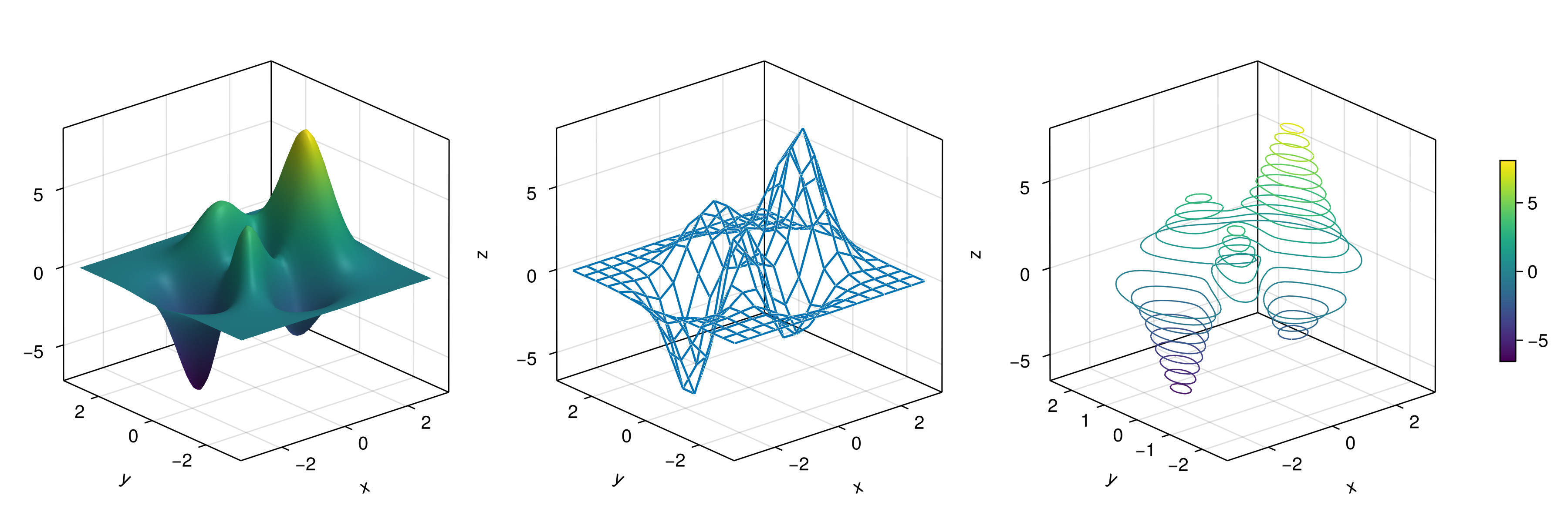
But, it can also be plotted with a heatmap(x, y, z), contour(x, y, z) or contourf(x, y, z):
function heatmap_contour_and_contourf()
    x, y, z = peaks()
    fig = Figure(size=(1200, 400))
    axs = [Axis(fig[1, i]; aspect=DataAspect()) for i = 1:3]
    hm = heatmap!(axs[1], x, y, z)
    contour!(axs[2], x, y, z; levels=20)
    contourf!(axs[3], x, y, z)
    Colorbar(fig[1, 4], hm, height=Relative(0.5))
    fig
end
JDS.heatmap_contour_and_contourf()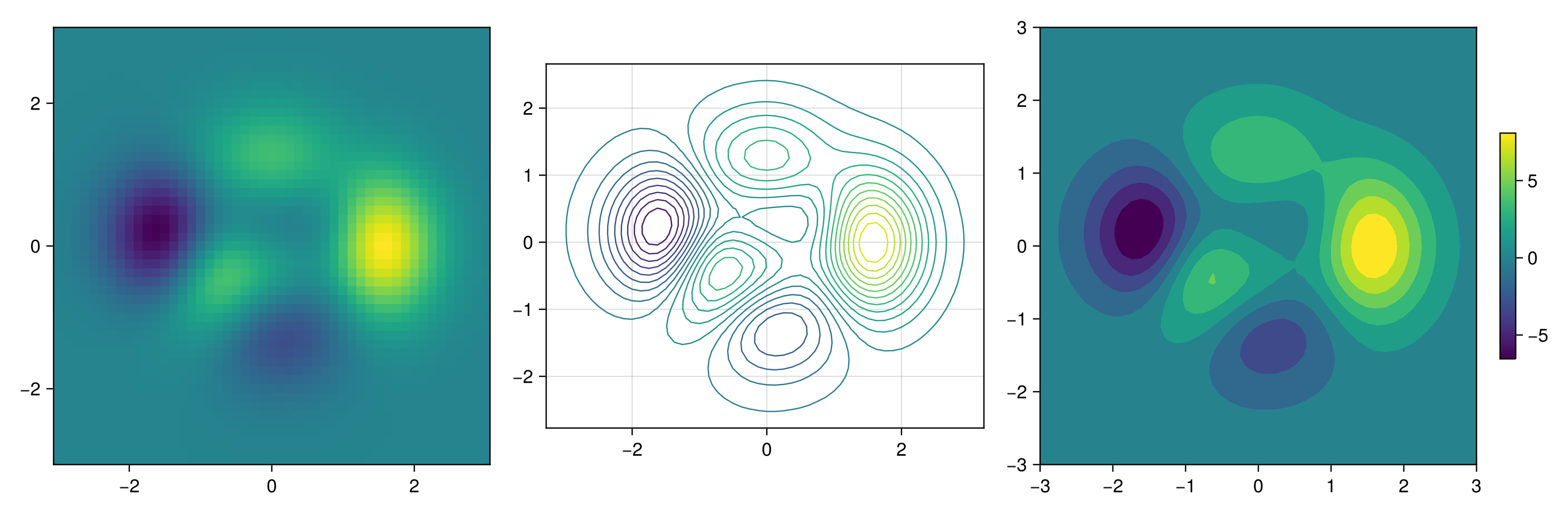
Additionally, by changing Axis to an Axis3, these plots will be automatically be in the x-y plane at z=0:
function heatmap_contour_and_contourf_in_a_3d_plane()
    x, y, z = peaks()
    fig = Figure(size=(1200, 400))
    axs = [Axis3(fig[1, i]) for i = 1:3]
    hm = heatmap!(axs[1], x, y, z)
    contour!(axs[2], x, y, z; levels=20)
    contourf!(axs[3], x, y, z)
    Colorbar(fig[1, 4], hm, height=Relative(0.5))
    fig
end
JDS.heatmap_contour_and_contourf_in_a_3d_plane()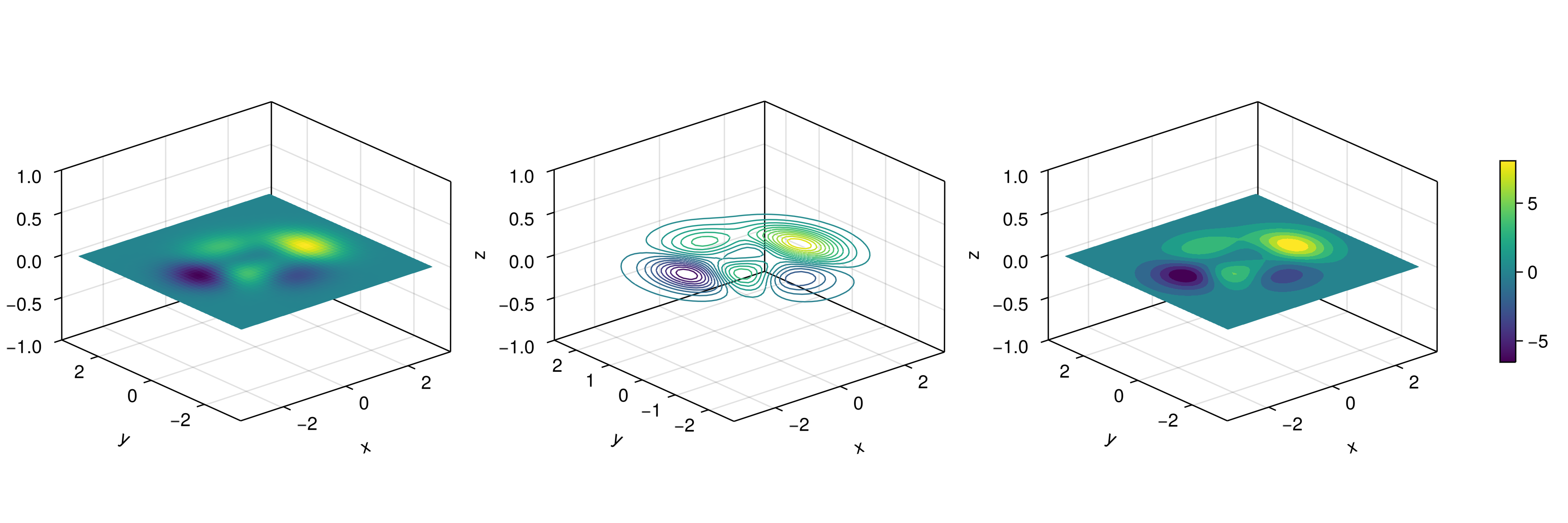
Something else that is easy to do is to mix all these plotting functions into just one plot, namely:
using TestImagesfunction mixing_surface_contour3d_contour_and_contourf()
img = testimage("coffee.png")
x, y, z = peaks()
cmap = :Spectral_11
fig = Figure(size=(1200, 800), fontsize=26)
ax1 = Axis3(fig[1, 1]; aspect=(1, 1, 1),
elevation=π/6, perspectiveness=0.5,
xzpanelcolor=(:black, 0.75), yzpanelcolor=:black,
zgridcolor=:grey70, ygridcolor=:grey70, xgridcolor=:grey70)
ax2 = Axis3(fig[1, 3]; aspect=(1, 1, 1),
elevation=π/6, perspectiveness=0.5)
hm = surface!(ax1, x, y, z; colormap=(cmap, 0.95), shading=MultiLightShading)
contour3d!(ax1, x, y, z .+ 0.02; colormap=cmap, levels=20, linewidth=2)
# get final limits
xmin, ymin, zmin = minimum(ax1.finallimits[])
xmax, ymax, zmax = maximum(ax1.finallimits[])
contour!(ax1, x, y, z; colormap=cmap, levels=20,
transformation=(:xy, zmax))
contourf!(ax1, x, y, z; colormap=cmap,
transformation=(:xy, zmin))
Colorbar(fig[1, 2], hm, width=15, ticksize=15, tickalign=1,
height=Relative(0.35))
# transformations into planes
heatmap!(ax2, x, y, z; colormap=:viridis,
transformation=(:yz, 3.5))
contourf!(ax2, x, y, z; colormap=:CMRmap,
transformation=(:xy, -3.5))
contourf!(ax2, x, y, z; colormap=:bone_1,
transformation=(:xz, 3.5))
image!(ax2, -3 .. 3, -3 .. 2, rotr90(img);
transformation=(:xy, 3.8))
xlims!(ax2, -3.8, 3.8)
ylims!(ax2, -3.8, 3.8)
zlims!(ax2, -3.8, 3.8)
fig
end
JDS.mixing_surface_contour3d_contour_and_contourf()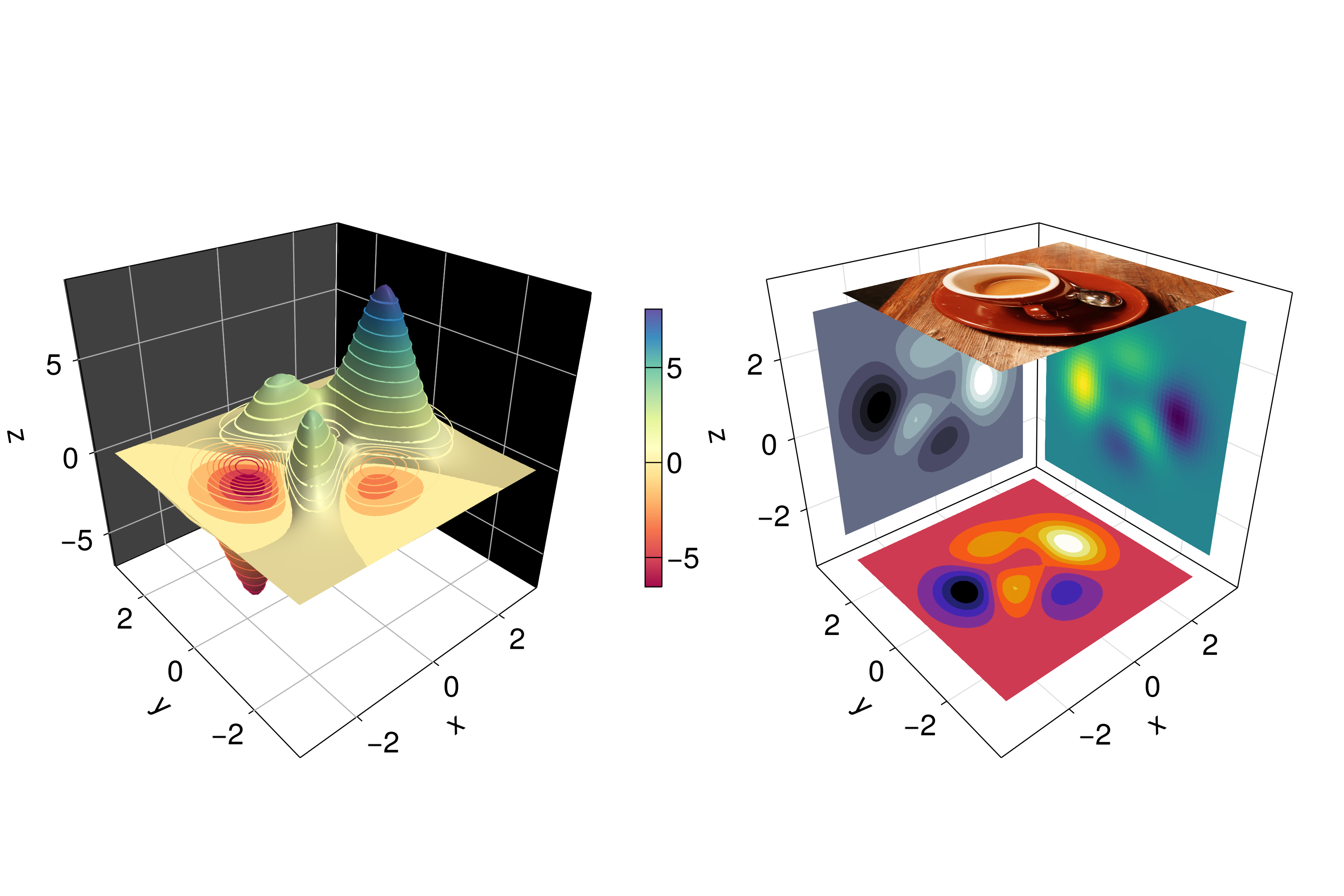
Not bad, right? From there is clear that any heatmap’s, contour’s, contourf’s or image can be plotted into any plane via a transformation and that the planes can be coloured, i.e. xzpanelcolor=:black.
6.9.3 Arrows and Streamplots
arrows and streamplot are plots that might be useful when we want to know the directions that a given variable will follow. See a demonstration below18:
using LinearAlgebrafunction arrows_and_streamplot_in_3d()
ps = [Point3f(x, y, z) for x=-3:1:3 for y=-3:1:3 for z=-3:1:3]
ns = map(p -> 0.1 * rand() * Vec3f(p[2], p[3], p[1]), ps)
lengths = norm.(ns)
flowField(x, y, z) = Point(-y + x * (-1 + x^2 + y^2)^2,
x + y * (-1 + x^2 + y^2)^2, z + x * (y - z^2))
fig = Figure(size=(1200, 800), fontsize=26)
axs = [Axis3(fig[1, i]; aspect=(1,1,1), perspectiveness=0.5) for i=1:2]
arrows!(axs[1], ps, ns, color=lengths, arrowsize=Vec3f(0.2, 0.2, 0.3),
linewidth=0.1)
streamplot!(axs[2], flowField, -4 .. 4, -4 .. 4, -4 .. 4,
colormap=:plasma, gridsize=(7, 7), arrow_size=0.25, linewidth=1)
fig
end
JDS.arrows_and_streamplot_in_3d()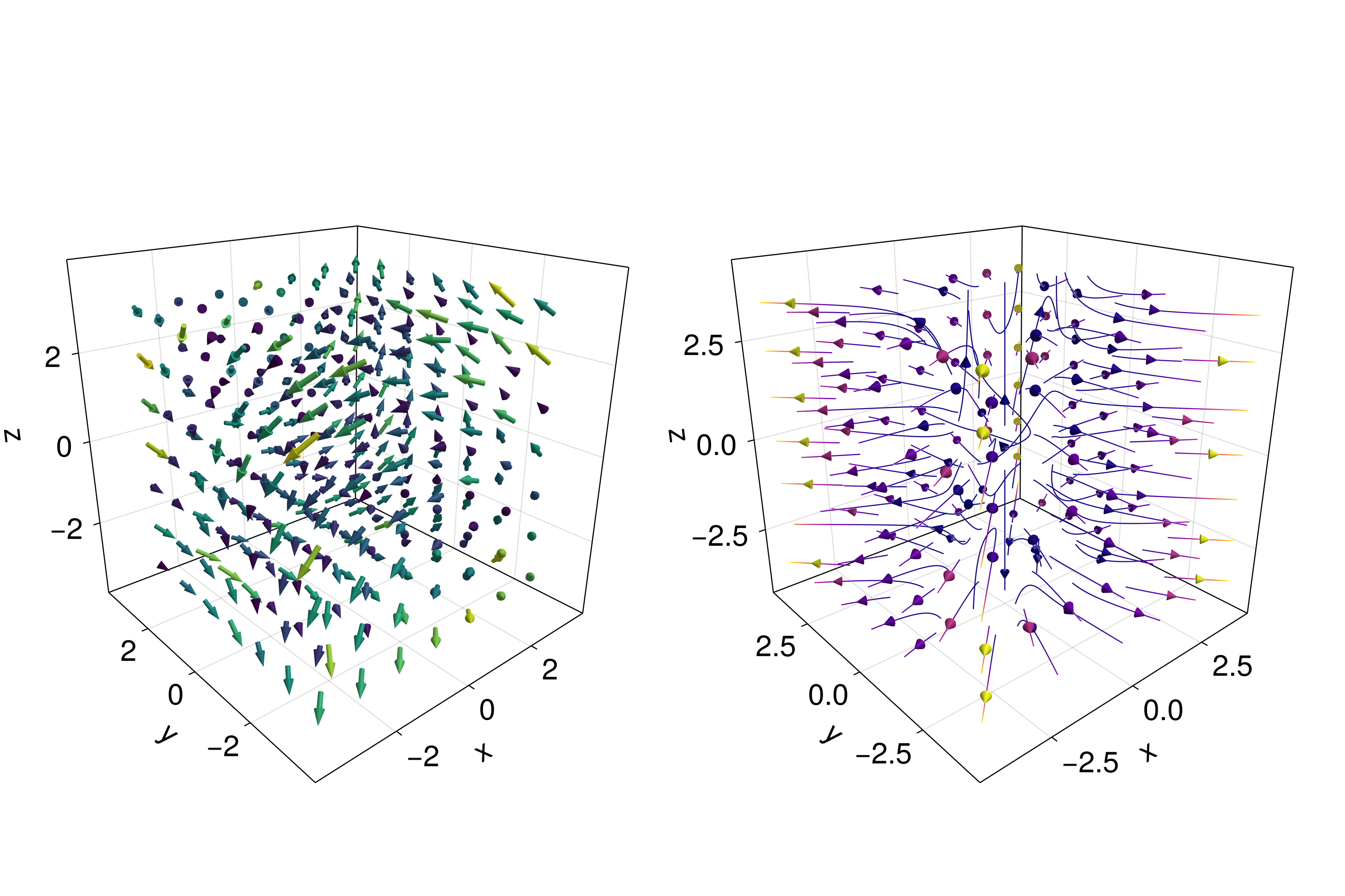
Other interesting examples are a mesh(obj), a volume(x, y, z, vals), and a contour(x, y, z, vals).
6.9.4 Meshes and Volumes
Drawing meshes comes in handy when you want to plot geometries, like a Sphere or a Rectangle, i.e. FRect3D. Another approach to visualize points in 3D space is by calling the functions volume and contour, which implements ray tracing to simulate a wide variety of optical effects. See the next examples:
using GeometryBasicsfunction mesh_volume_contour()
# mesh objects
rectMesh = Rect3f(Vec3f(-0.5), Vec3f(1))
recmesh = GeometryBasics.mesh(rectMesh)
sphere = Sphere(Point3f(0), 1)
# https://juliageometry.github.io/GeometryBasics.jl/stable/primitives/
spheremesh = GeometryBasics.mesh(Tesselation(sphere, 64))
# uses 64 for tesselation, a smoother sphere
colors = [rand() for v in recmesh.position]
# cloud points for volume
x = y = z = 1:10
vals = randn(10, 10, 10)
fig = Figure(size=(1200, 400))
axs = [Axis3(fig[1, i]; aspect=(1,1,1), perspectiveness=0.5) for i=1:3]
mesh!(axs[1], recmesh; color=colors, colormap=:rainbow, shading=NoShading)
mesh!(axs[1], spheremesh; color=(:white, 0.25), transparency=true)
volume!(axs[2], x, y, z, vals; colormap=Reverse(:plasma))
contour!(axs[3], x, y, z, vals; colormap=Reverse(:plasma))
fig
end
JDS.mesh_volume_contour()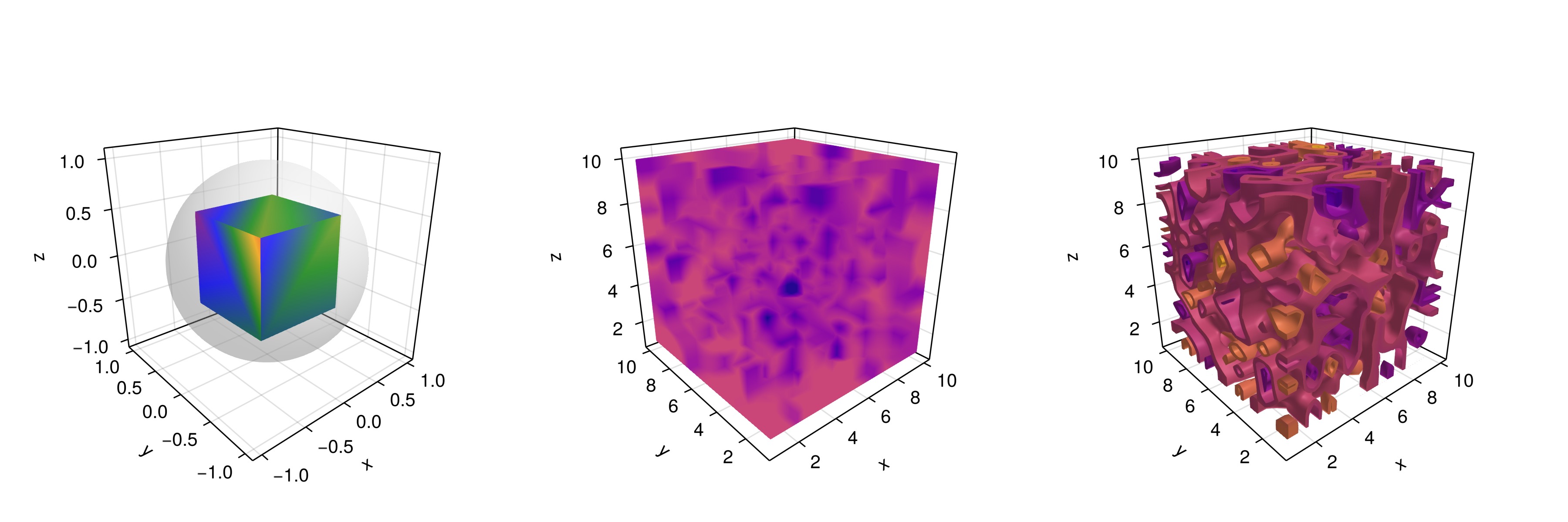
Note that here we are plotting two meshes into the same axis, one transparent sphere and a cube. So far, we have covered most of the 3D use-cases.
Taking as reference the previous example one can do the following custom plot with spheres and rectangles:
using GeometryBasics, ColorsFor the spheres let’s do a rectangular grid. Also, we will use a different color for each one of them. Additionally, we can mix spheres and a rectangular plane. Next, we define all the necessary data.
seed!(123)
spheresGrid = [Point3f(i,j,k) for i in 1:2:10 for j in 1:2:10
    for k in 1:2:10]
colorSphere = [RGBA(i * 0.1, j * 0.1, k * 0.1, 0.75) for i in 1:2:10
    for j in 1:2:10 for k in 1:2:10]
spheresPlane = [Point3f(i,j,k) for i in 1:2.5:23 for j in 1:2.5:10
    for k in 1:2.5:4]
cmap = get(colorschemes[:plasma], range(0, 1, 50))
colorsPlane = cmap[rand(1:50,50)]
rectMesh = Rect3f(Vec3f(-1, -1, 2.1), Vec3f(16, 11, 0.5))
recmesh = GeometryBasics.mesh(rectMesh)
colors = [RGBA(rand(4)...) for v in recmesh.position]
Then, the plot is simply done with:
function grid_spheres_and_rectangle_as_plate()
    perspectiveness=0.5
    aspect = :data
    # now the figure
    fig = with_theme(theme_dark()) do
        fig = Figure(size=(1200, 800))
        ax1 = Axis3(fig[1, 1]; aspect, perspectiveness, azimuth=0.72)
        ax2 = Axis3(fig[1, 2]; aspect, perspectiveness)
        meshscatter!(ax1, spheresGrid; color=colorSphere, markersize=1,
            shading=NoShading)
        meshscatter!(ax2, spheresPlane; color=colorsPlane, markersize=0.75,
            backlight=1.0f0)
        mesh!(recmesh; color=colors, colormap=:rainbow, shading=NoShading)
        limits!(ax1, 0, 10, 0, 10, 0, 10)
        fig
    end
    fig
end
JDS.grid_spheres_and_rectangle_as_plate()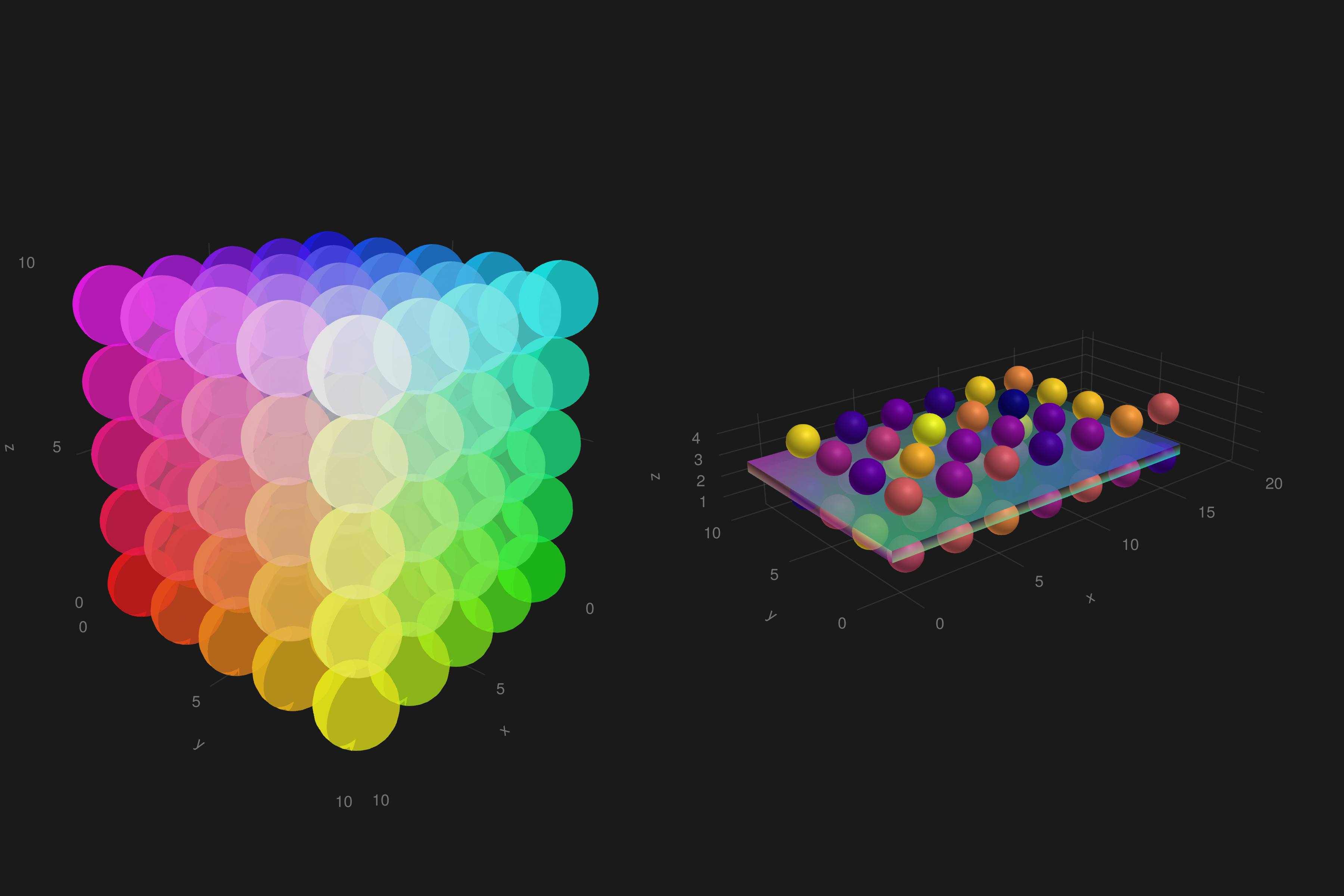
Here, the rectangle is semi-transparent due to the alpha channel added to the RGB color. The rectangle function is quite versatile, for instance 3D boxes are easy to implement which in turn could be used for plotting a 3D histogram. See our next example, where we are using again the peaks function and some additional definitions:
x, y, z = peaks(; n=15)
δx = (x[2] - x[1]) / 2
δy = (y[2] - y[1]) / 2
cbarPal = :Spectral_11
ztmp = (z .- minimum(z)) ./ (maximum(z .- minimum(z)))
cmap = get(colorschemes[cbarPal], ztmp)
cmap2 = reshape(cmap, size(z))
ztmp2 = abs.(z) ./ maximum(abs.(z)) .+ 0.15
here \(\delta x, \delta y\) are used to specify the box sizes. cmap2 will be the color for each box and ztmp2 will be used as a transparency parameter. See the output in the next figure.
function histogram_or_bars_in_3d()
    fig = Figure(size=(1200, 800), fontsize=26)
    ax1 = Axis3(fig[1, 1]; aspect=(1,1,1), elevation=π/6,
        perspectiveness=0.5)
    ax2 = Axis3(fig[1, 2]; aspect=(1,1,1), perspectiveness=0.5)
    rectMesh = Rect3f(Vec3f(-0.5, -0.5, 0), Vec3f(1, 1, 1))
    meshscatter!(ax1, x, y, 0 * z; marker=rectMesh, color=z[:],
        markersize=Vec3f.(2δx, 2δy, z[:]), colormap=:Spectral_11,
        shading=NoShading)
    limits!(ax1, -3.5, 3.5, -3.5, 3.5, -7.45, 7.45)
    meshscatter!(ax2, x, y, 0 * z; marker=rectMesh, color=z[:],
        markersize=Vec3f.(2δx, 2δy, z[:]), colormap=(:Spectral_11, 0.25),
        shading=NoShading, transparency=true)
    for (idx, i) in enumerate(x), (idy, j) in enumerate(y)
        rectMesh=Rect3f(Vec3f(i-δx, j-δy, 0), Vec3f(2δx, 2δy, z[idx,idy]))
        recmesh=GeometryBasics.mesh(rectMesh)
        lines!(ax2, recmesh; color=(cmap2[idx, idy], ztmp2[idx, idy]))
    end
    fig
end
JDS.histogram_or_bars_in_3d()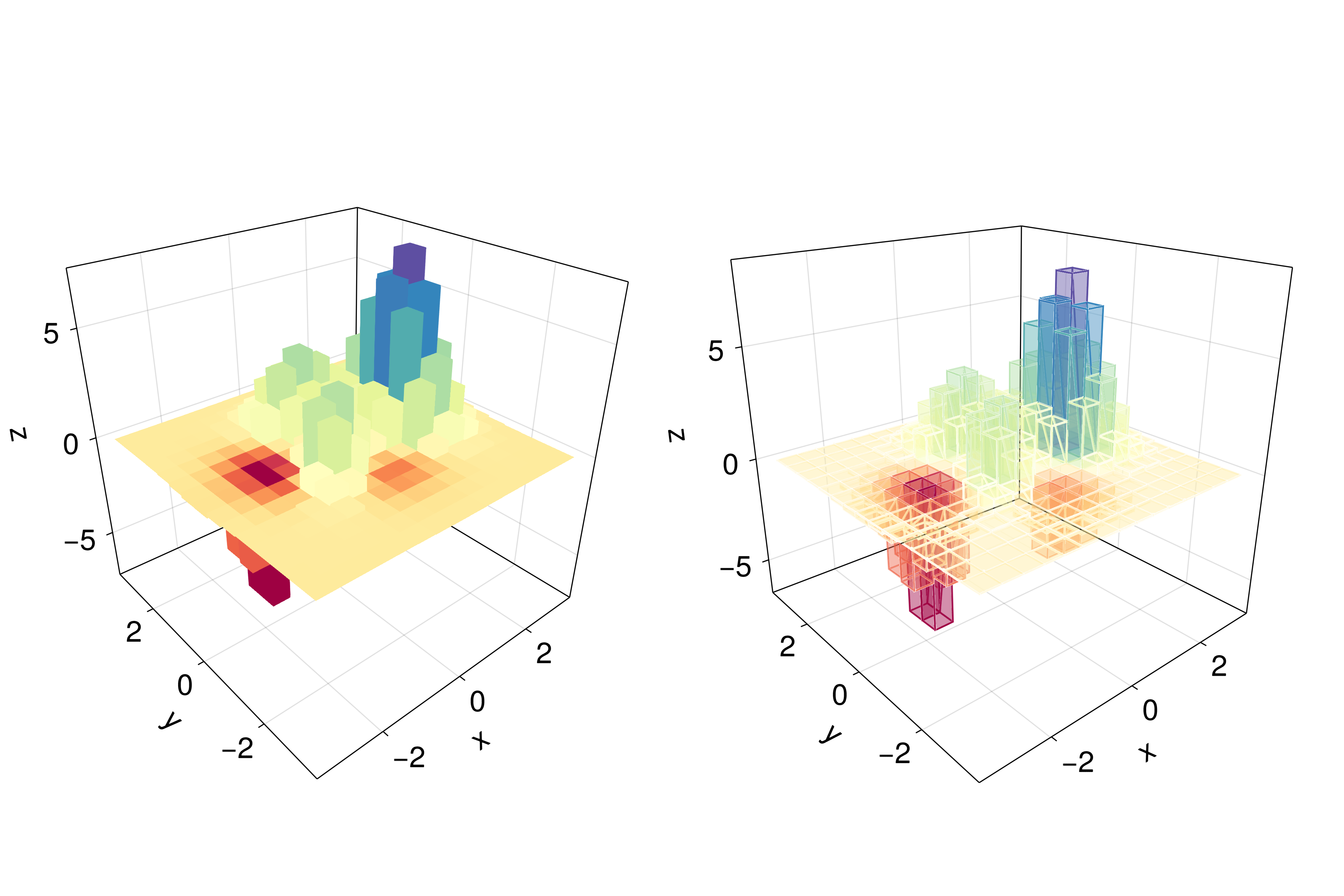
Note, that you can also call lines or wireframe over a mesh object.
6.9.5 Filled Line and Band
For our last example we will show how to do a filled curve in 3D with band and some linesegments:
function filled_line_and_linesegments_in_3D()
    xs = range(-3, 3, 10)
    lower = [Point3f(i, -i, 0) for i in range(0, 3, 100)]
    upper = [Point3f(i, -i, sin(i) * exp(-(i + i)))
        for i in range(0, 3, length=100)]
    fig = Figure(size=(1200, 800))
    axs = [Axis3(fig[1, i]; elevation=π/6, perspectiveness=0.5) for i=1:2]
    band!(axs[1], lower, upper; color=repeat(norm.(upper), outer=2),
        colormap=:CMRmap)
    lines!(axs[1], upper, color=:black)
    linesegments!(axs[2], cos.(xs), xs, sin.(xs); linewidth=5,
        color=1:length(xs))
    fig
end
JDS.filled_line_and_linesegments_in_3D()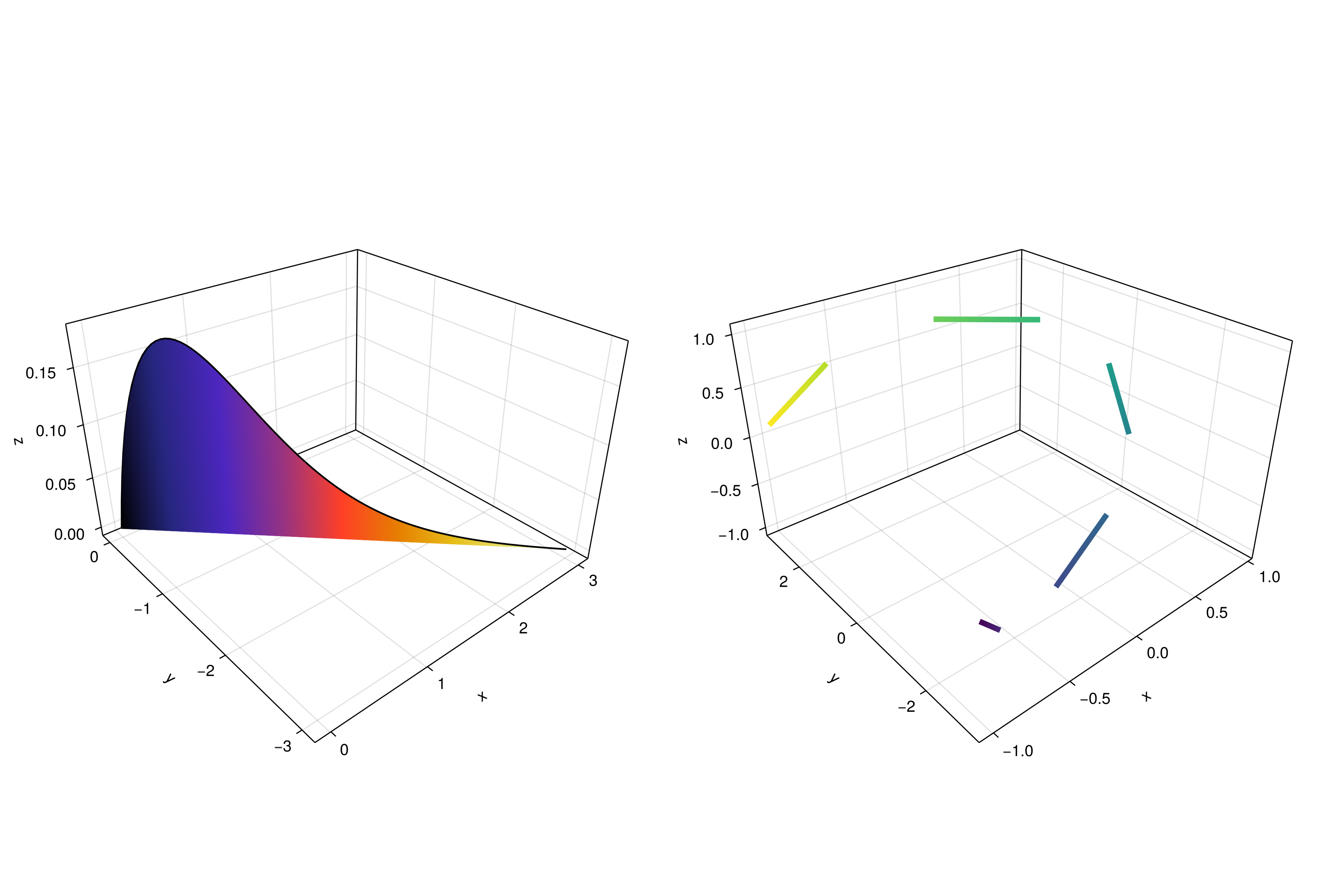
Finally, our journey doing 3D plots has come to an end. You can combine everything we exposed here to create amazing 3D images!
